Refining this Australian brand's creative direction to match its joyful spirit
THE OPPORTUNITY
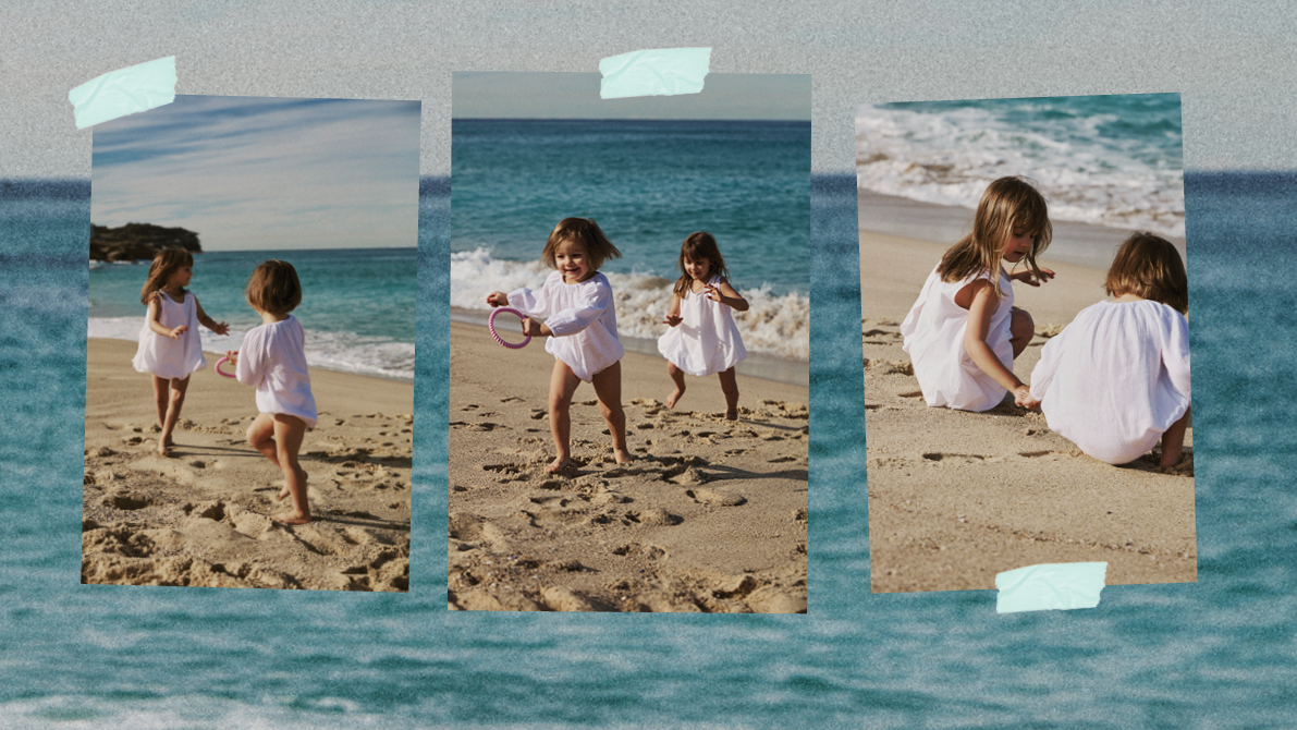
After a successful launch, mum-founded children’s wear label Minnie & Minty approached Tomoro to evolve its brand identity. The goal: to refine its creative direction and visual language to match its joyful, handcrafted spirit and growing audience.
OUR SOLUTION
Using our Rise&Shine* brand strategy process, we helped Minnie & Minty define its purpose, proposition and visual identity. We developed a new brand architecture and tone of voice rooted in movement, play, and authenticity, the values that capture the heart of the brand.
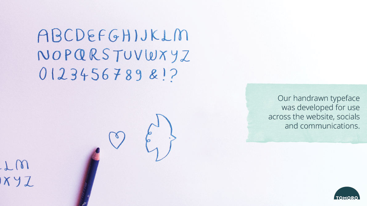
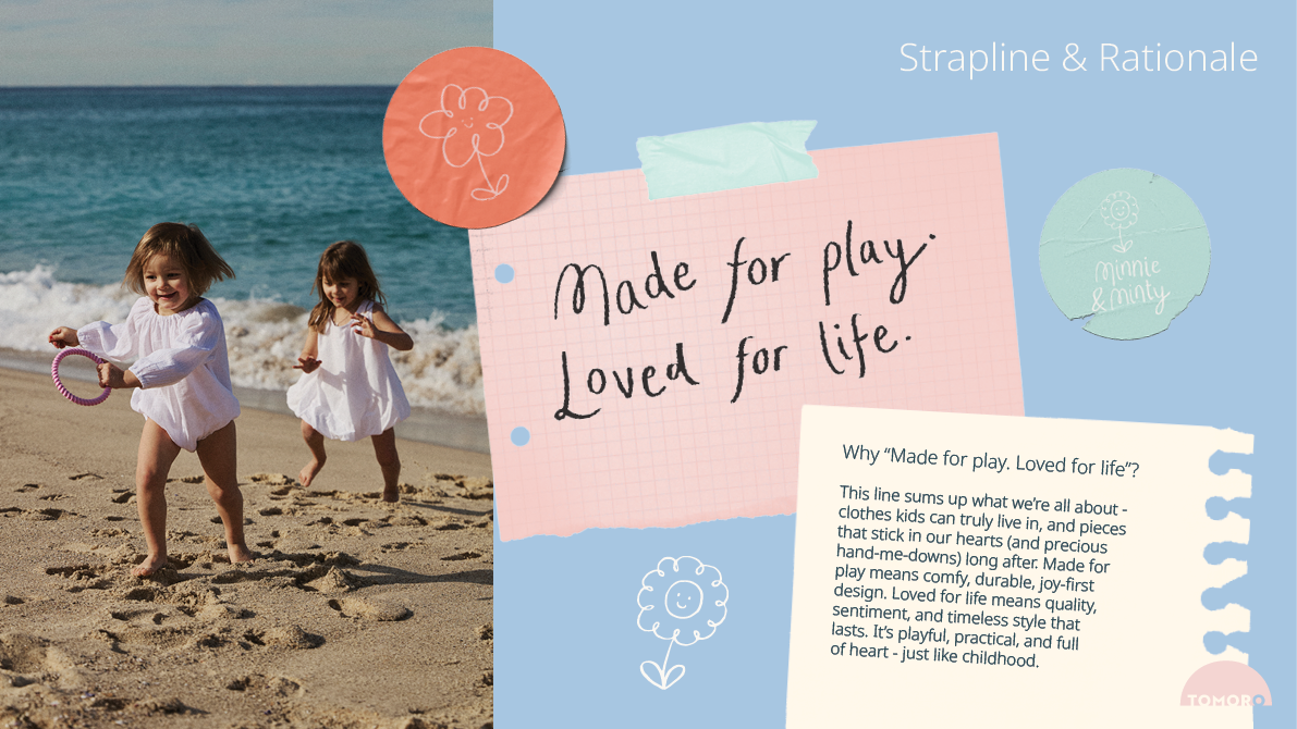
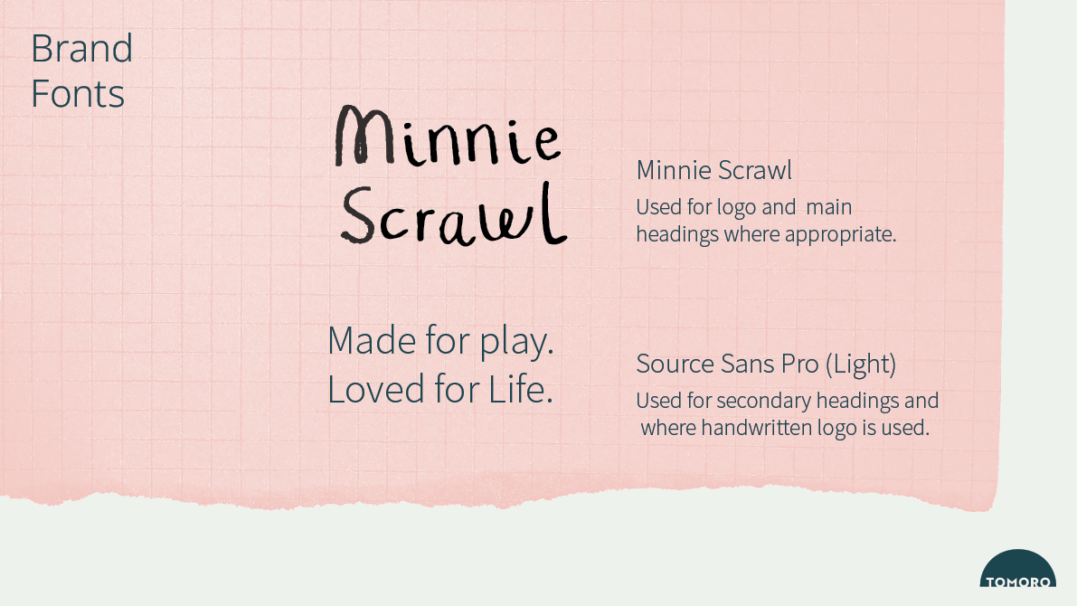
Visually, we introduced a hand-drawn logo and bespoke typeface inspired by the loops and flow of childhood doodles, paired with a sun-washed colour palette and soft pencil textures to express warmth and approachability. The new strapline “Made for play. Loved for life.” perfectly encapsulated the brand’s story, celebrating comfort, joy and lasting quality.
THE RESULTS
The rebrand gave Minnie & Minty a cohesive, heartfelt identity that feels distinctly Australian, playful, and real. It now stands out in the childrenswear space as a brand that’s authentic, handmade and joyfully human, built by a mum, inspired by kids, and made for real life.


